
Case Study
Branding for photographers: Manu Valgas Fotografia
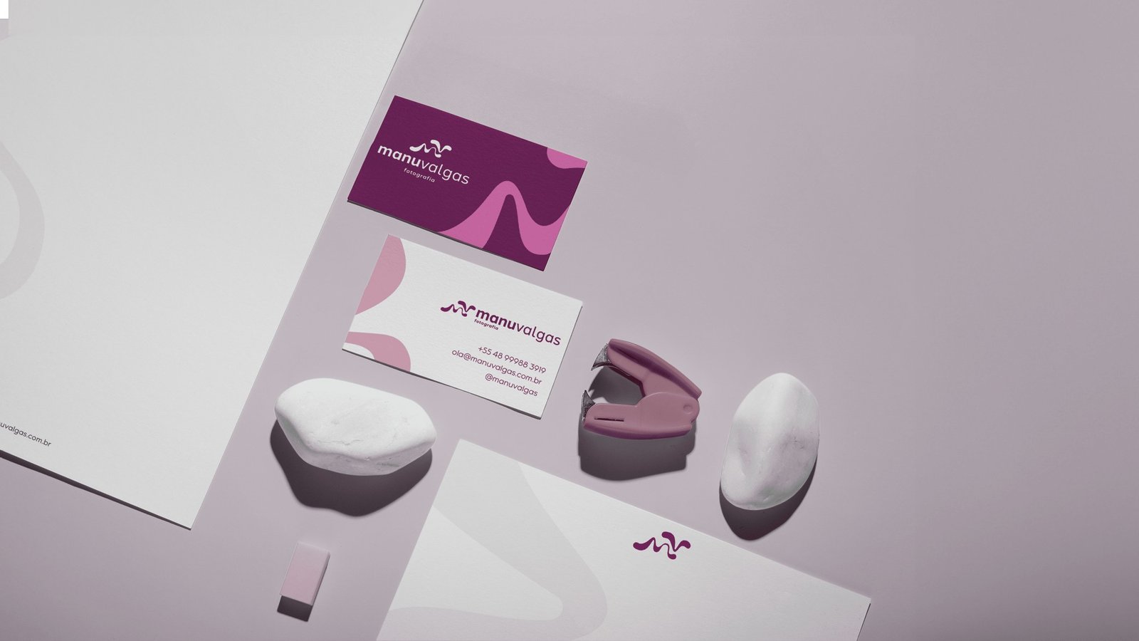
Manu Valgas left law to make a living from photography. She came to Nozes with a request common to new businesses: a visual identity and a social media presence. The first conversation revealed a need that came before any logo. She needed to decide what kind of photographer she wanted to be.
The challenge: starting a new career with the right foundation
Every career change comes with a sense of urgency. The desire to show up, have a logo, a website and a beautiful feed, and prove to the world that the change worked. That’s how Manu arrived. She believed the problem was her image and that, once the look was right, clients would gradually follow.
But the essentials were still undefined. Who to serve, what place to occupy in Florianópolis’s photography market and what would set her apart from dozens of professionals with similar portfolios. Without those answers, any visual identity would be a well-designed guess.
The consultancy began before the design, giving direction to the emerging brand.
The strategy: a space no one had claimed
The branding consultancy explored the local photography market and a process of self-discovery with Manu. Together, these revealed an opportunity: an unclaimed space for photography that celebrates women’s individuality with sensitivity and a creative eye.
The positioning grew from her own experience. Someone who has reinvented herself understands reinvention. That’s what Manu Valgas Fotografia offers: a space where each woman leads her own story, photographed for what makes her distinctive.
With the audience, offering and message defined, the visual identity had a clear basis. Every choice followed from it.
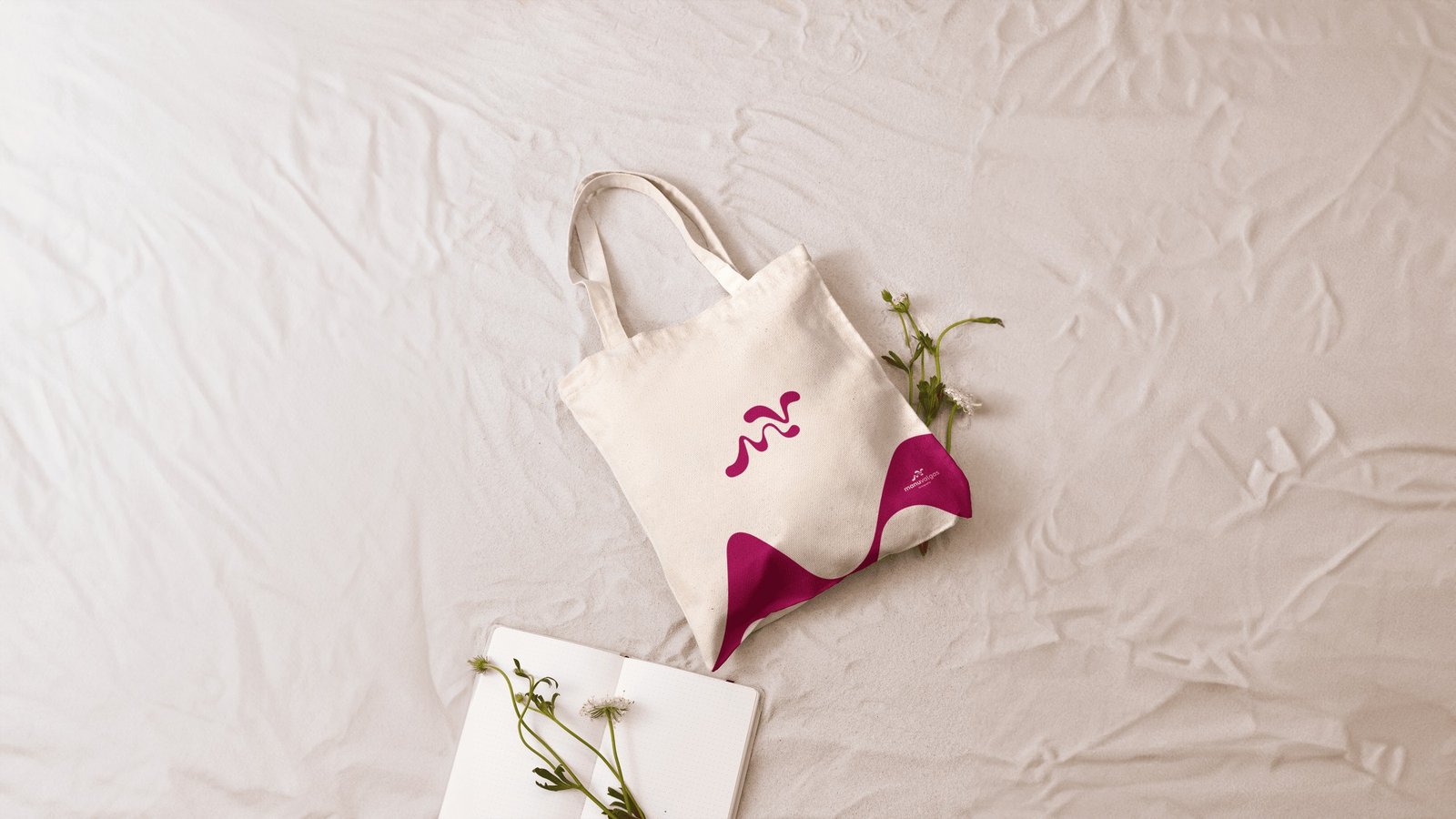
The design: liquid lettering for stories that never repeat
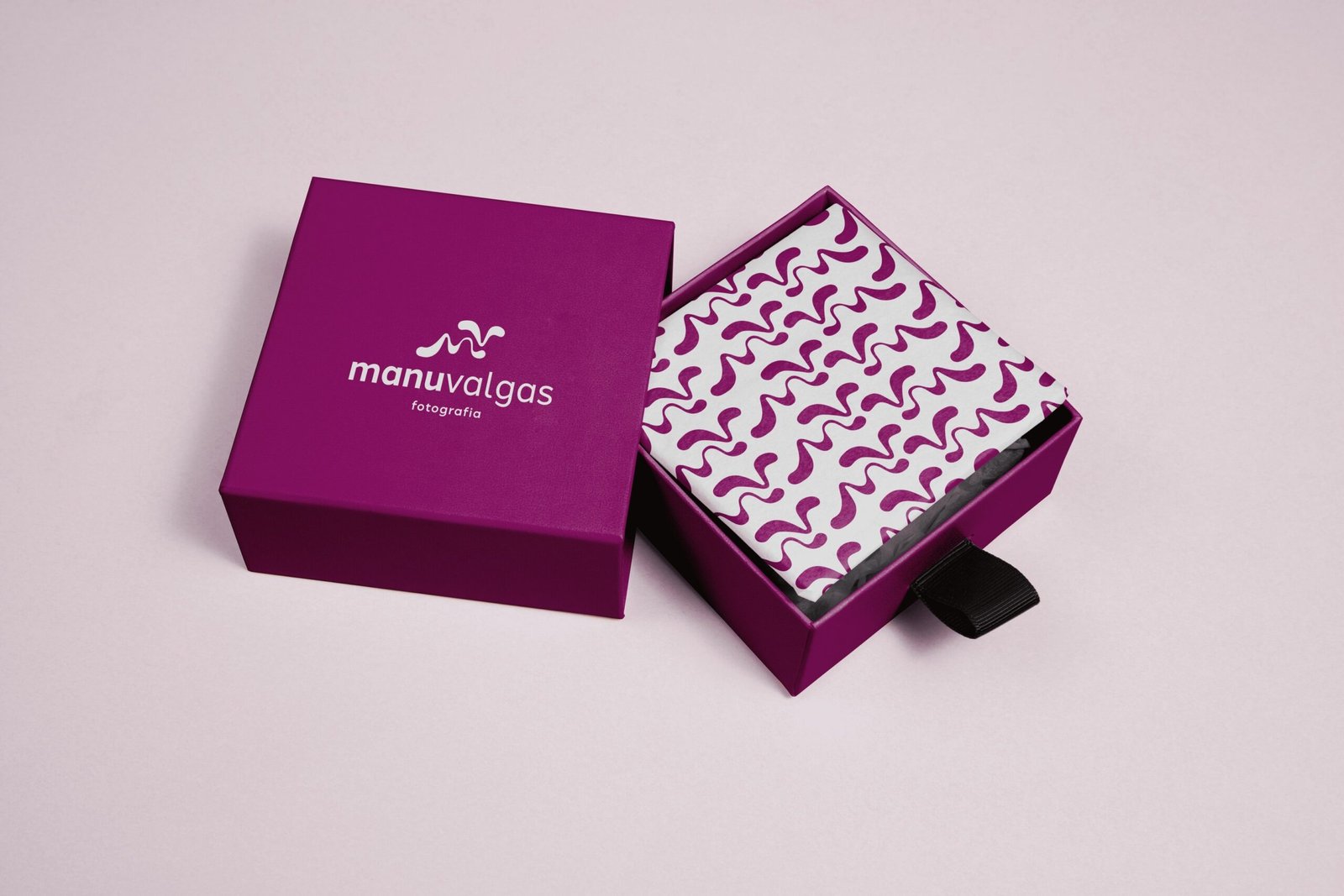
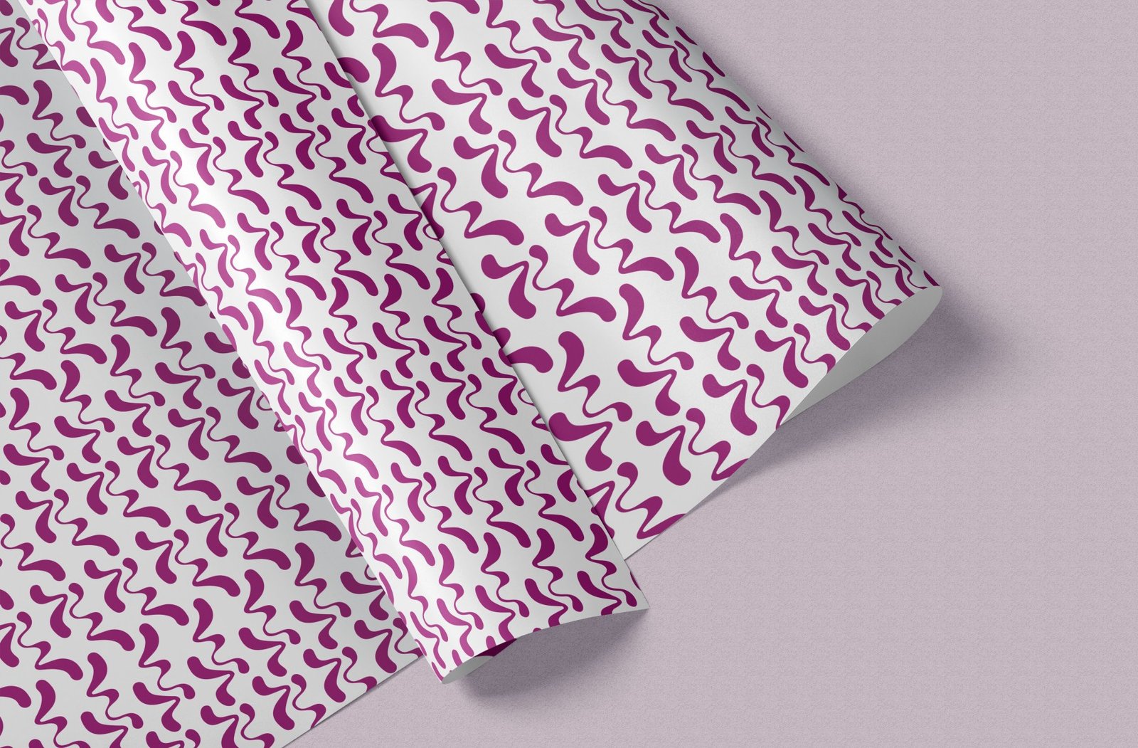
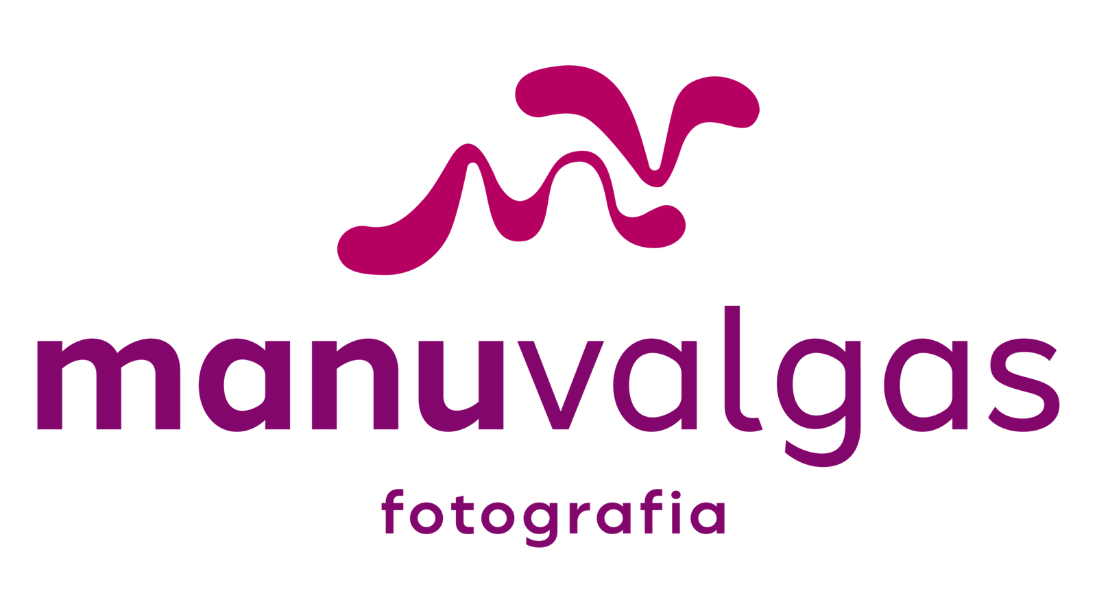
The symbol resembles ink strokes. The idea of liquid lettering expresses the brand’s central thought: just as ink takes a new shape with every gesture, each woman photographed has a form of her own, and the identity adapts to it.
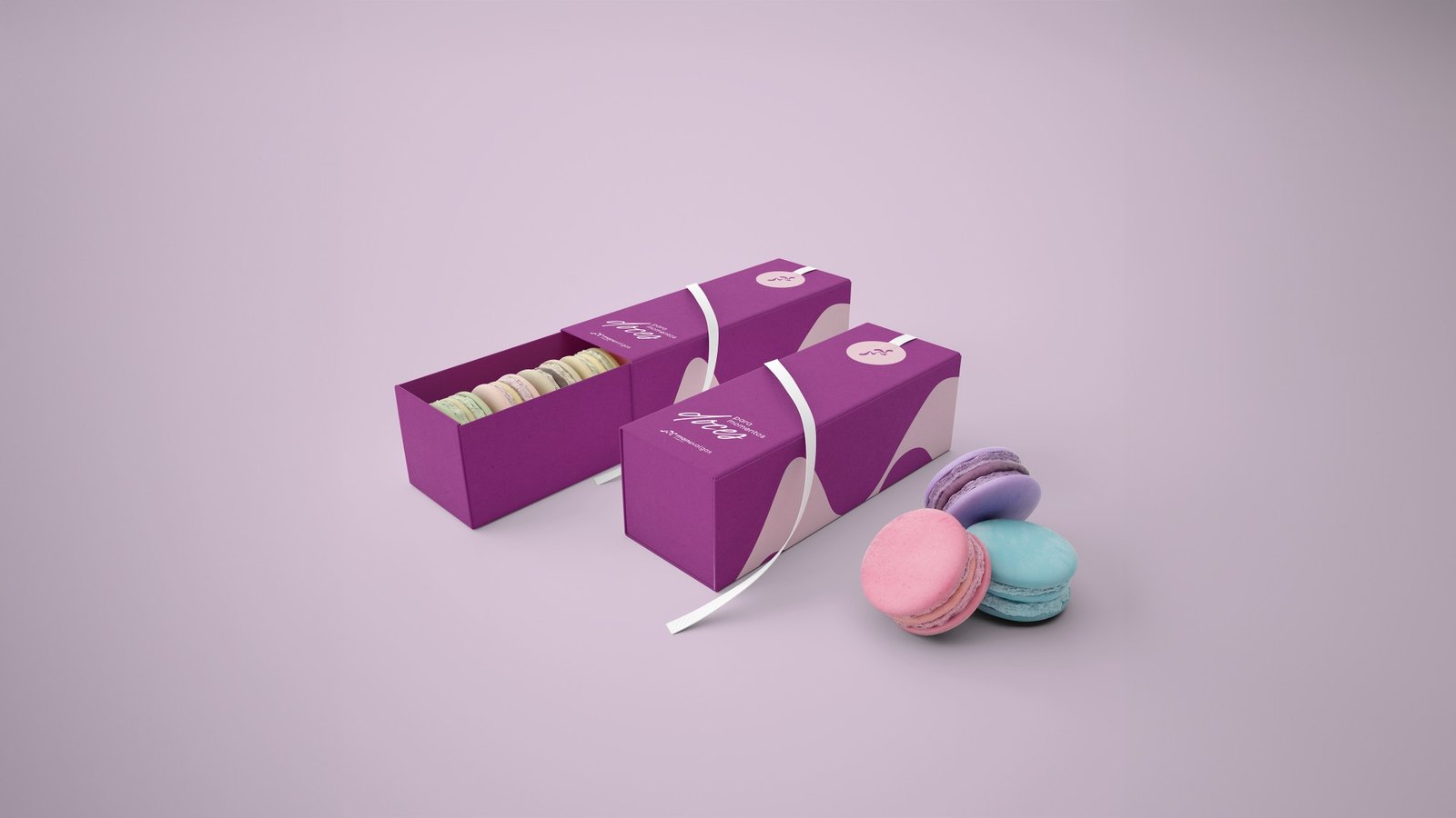
Violet leads the palette. The color evokes inner strength and transformation, the same movement Manu experienced in her career and invites her clients to explore in front of the camera. Rounded typography makes the brand approachable for women who feel unsure about a photo session.
Every visual choice supports an earlier strategic decision. That’s what gives the identity substance.
Liquid lettering
The flowing strokes express the brand’s perspective: every session takes its own shape, built around the woman being photographed.
Movement
The brand leaves room for each client’s expression, presence and story, without imposing a standard of beauty.
Closeness
Rounded shapes make the identity more approachable while preserving its visual presence.
Expression
The visual language grows from the positioning: celebrating individuality with sensitivity, creativity and direction.
Application
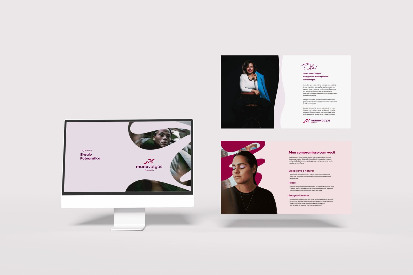
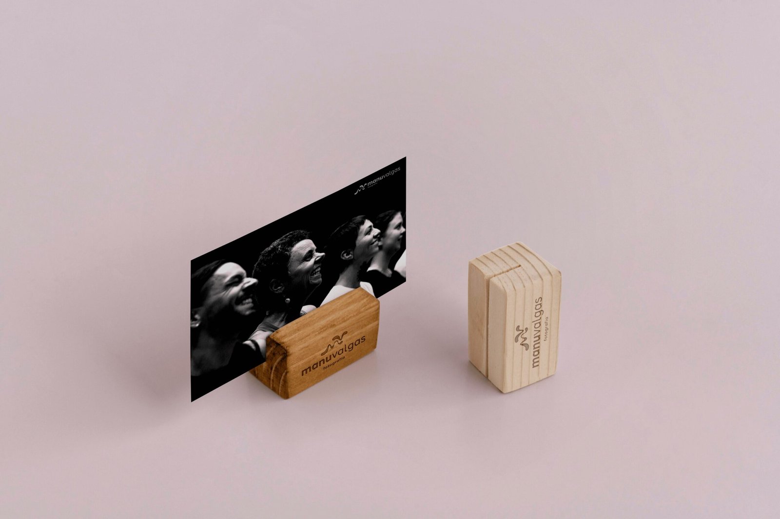
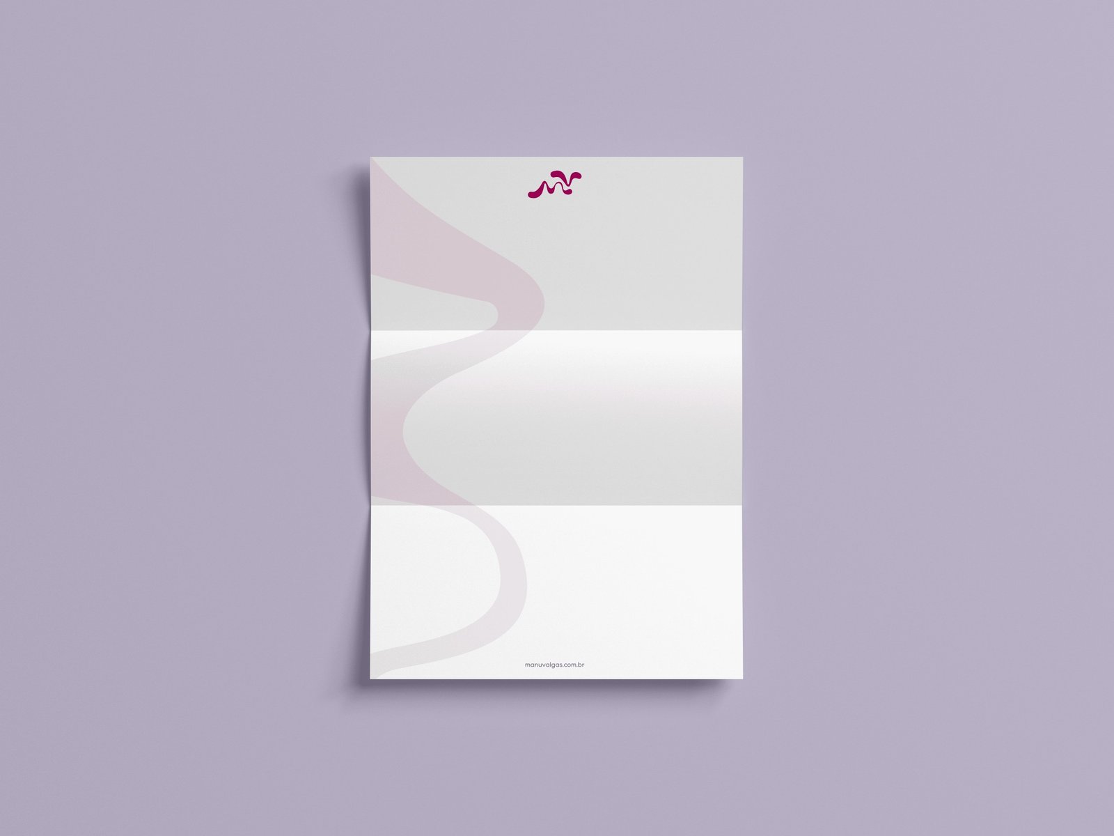
The visual system extends to stationery, digital media, packaging and materials that shape the client experience.
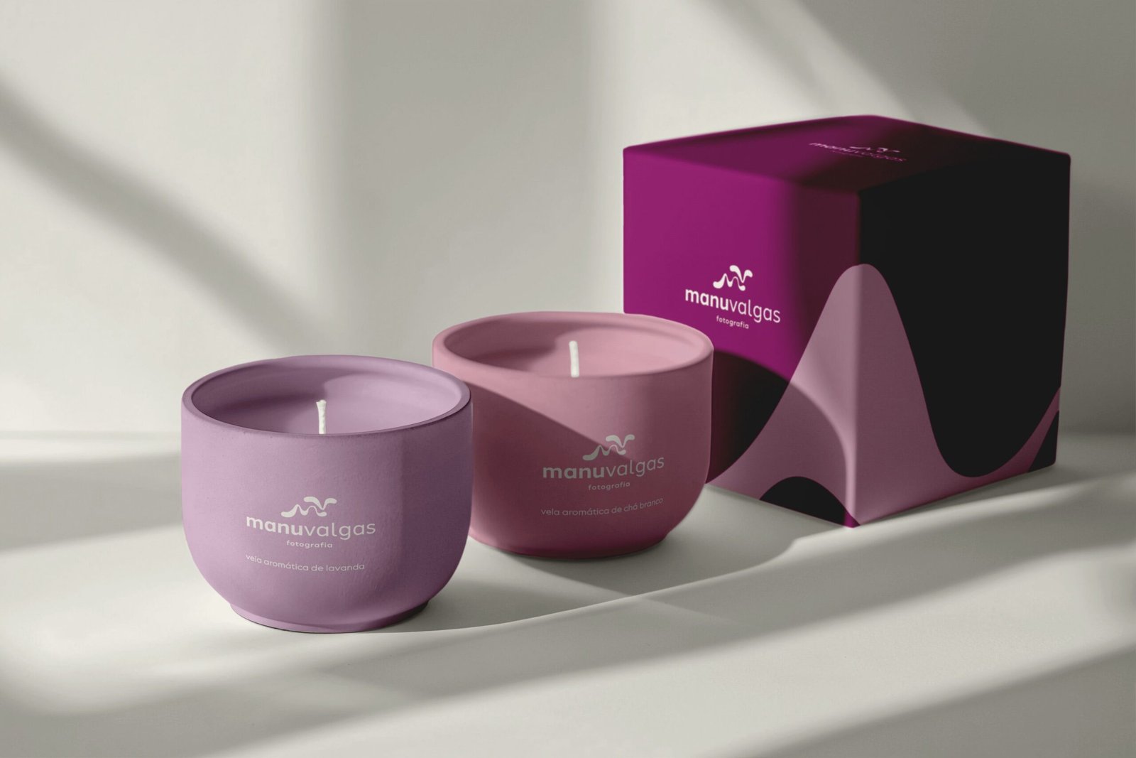
The color palette: violet
Violet evokes inner strength and transformation, representing women’s ability to express themselves in their own way. In the identity, it creates presence while keeping the experience welcoming.
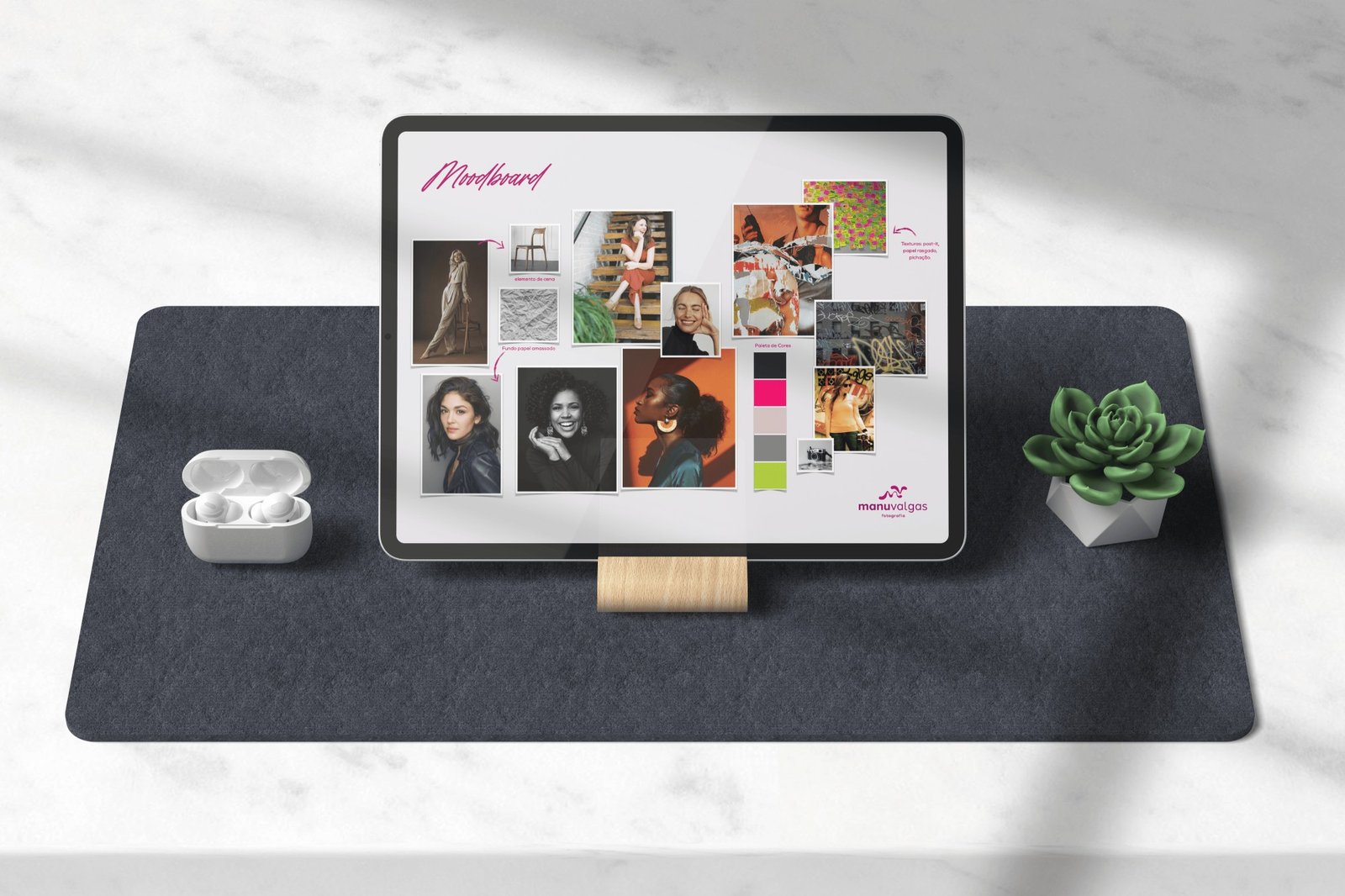
Supporting tones soften the palette and help the brand move between sensitivity, creativity and professionalism.
The result: clarity that built confidence
Manu’s biggest gain showed up in the way she made decisions. With a clear audience, offering and presentation, the business gained direction. In her words:
“When I hired the consultancy, I thought my problem was mostly about image: a social media presence and a visual identity I didn’t have. I thought that would be enough and that clients would gradually come, without any planning. Through the consultancy, I realized I needed to plan and organize much more, and that it wasn’t a waste of time. It was an investment in my brand. Knowing which clients we want, what work we want to present and how we’ll present ourselves gives you confidence, a sense of security. If I hadn’t done it, I’m sure I’d still be spinning my wheels, without a clear vision of what I wanted for my business. It was essential.”
Emanuela Valgas · founder of Manu Valgas Fotografia
For a brand at the start of its journey, this is the gain that supports all the others: knowing where it’s going.
Project details
Nozes team
- Strategy and design
- Mariana Belchior de Araújo
- Service
- Brand strategy consultancy and visual identity
- Duration and year
- 6 months · 2024
Client team
- Manu Valgas Fotografia
- Emanuela Valgas
A new professional chapter needs brand direction.
If you’re building a new chapter and need to turn your intentions into positioning, Nozes’s branding consultancy provides that foundation.
Talk to Nozes Explore our branding consultancyOr, if you prefer: ola@somosnozes.com.br