
Case Study
Branding for personal trainers: Rodrigo Ferreira
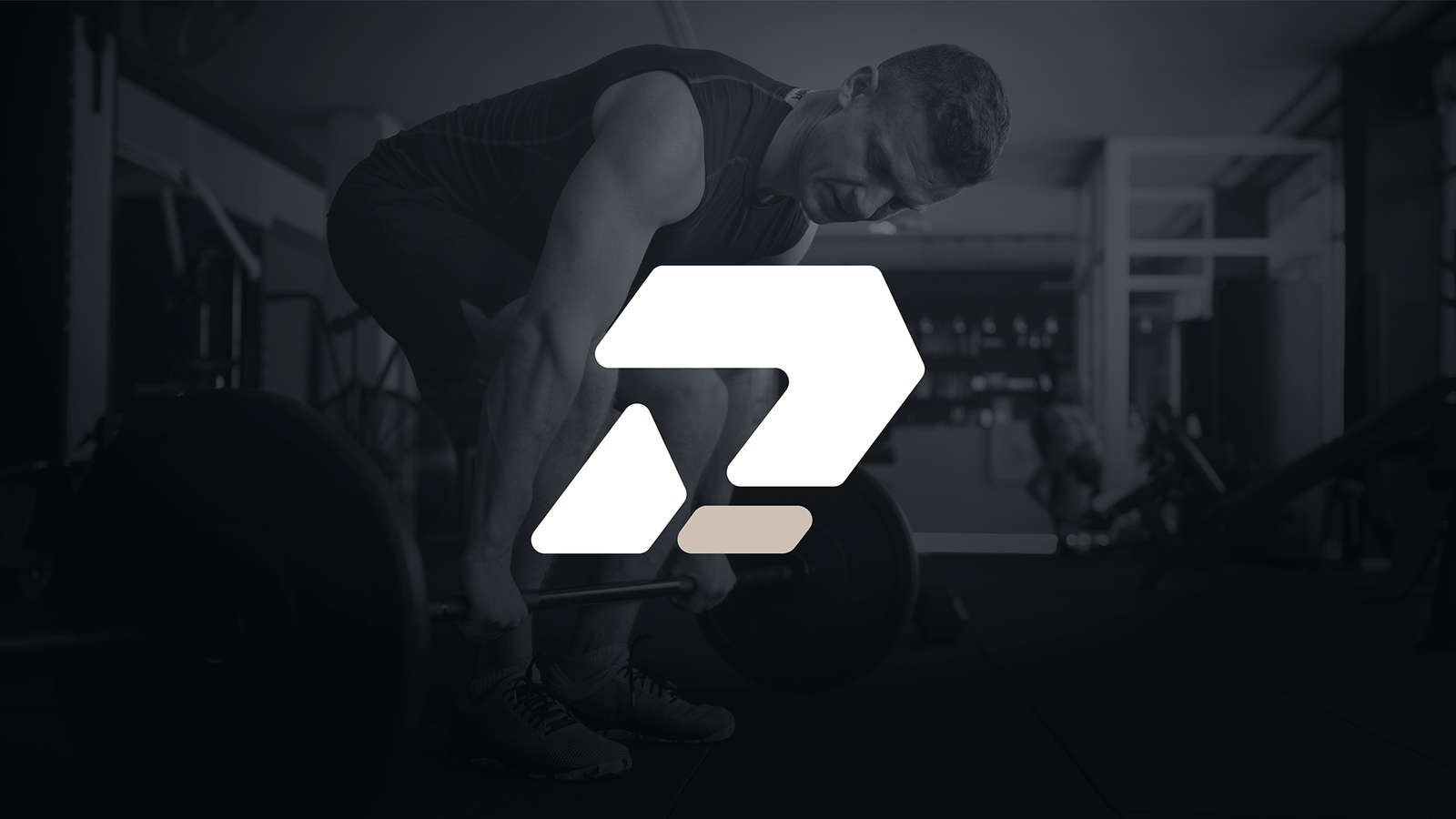
Nearly three decades in strength training, experience in bodybuilding, a method of his own and a solid client base. Rodrigo wanted a strong, striking brand to represent him.
The challenge
Rodrigo’s clients are discerning. Women aged 30 to 50, men aged 40 to 60, people who appreciate good food, a glass of wine on the weekend and a pleasant environment. They train for longevity and independence.
Rodrigo had yet to give his brand the attention it deserved. A brand that represents the value of the work.

The strategy
The brand strategy consultancy studied Rodrigo’s method. His work combines postural assessment, tailored programming and a close focus on movement quality. He calls it intelligent strength training: maximum gains with as little strain as possible, using technique to help prevent injury and support consistency.
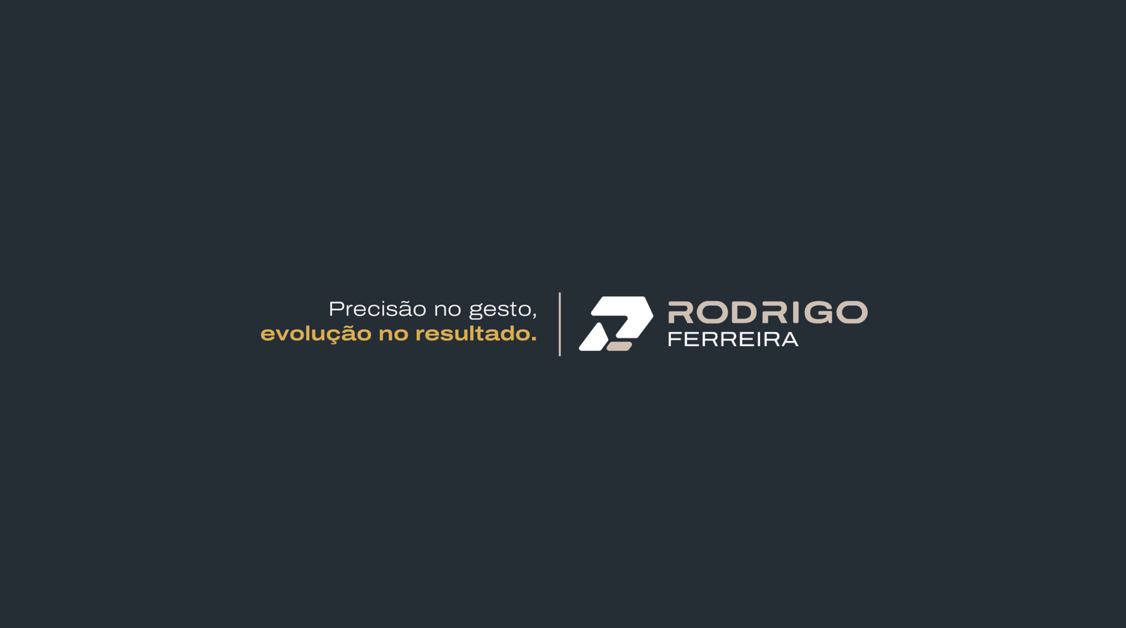
The purpose grew from there: making what feels difficult achievable, strengthening people’s bodies and the lives they build. The tagline captures the process: precision in movement, progress in results.
Four principles turned that positioning into design rules: structural strength, precision, controlled movement and technical expertise with a human touch. Every visual decision was assessed against them.

The design
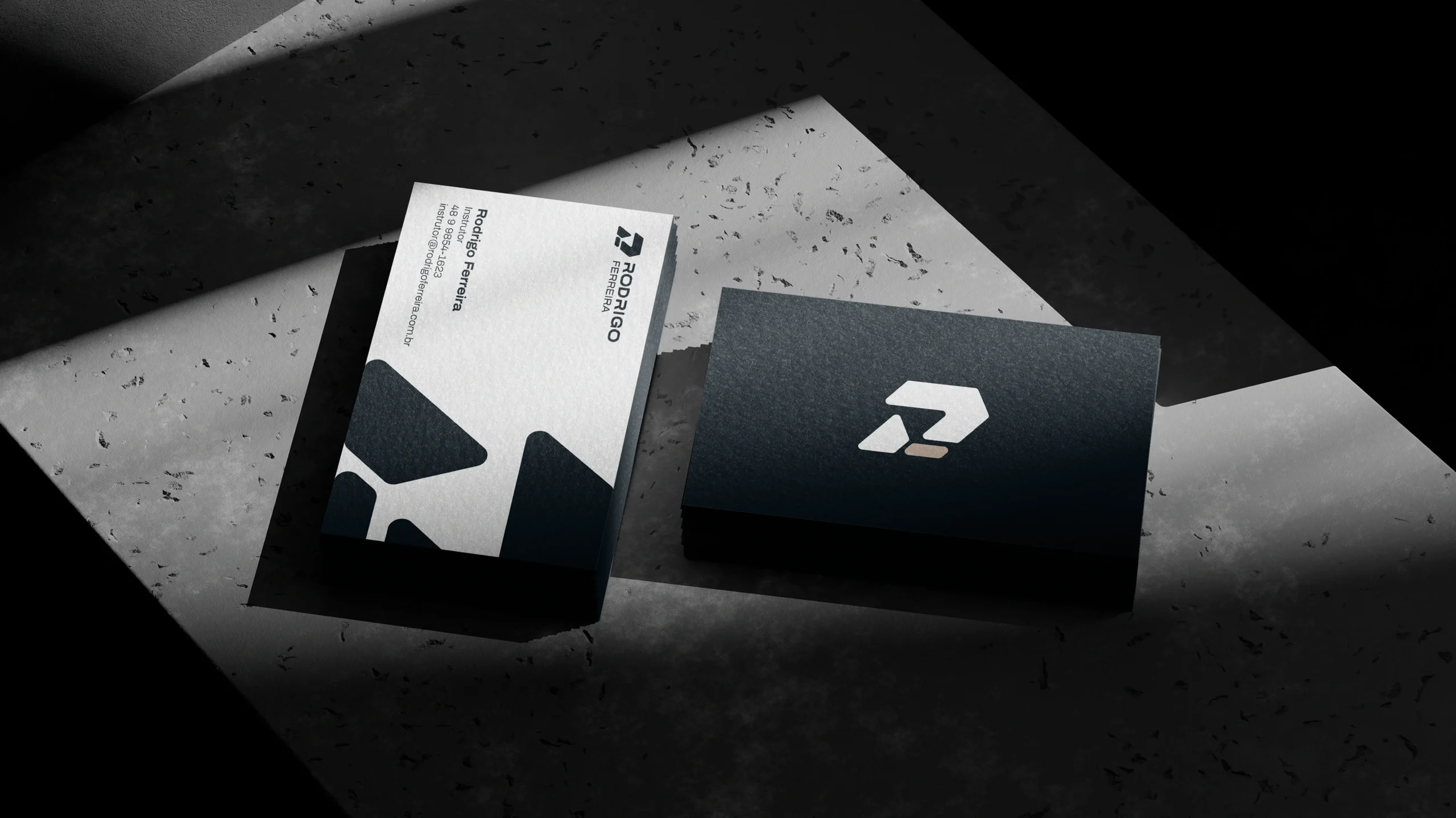
The symbol grows from the letter R, with a calculated slant suggesting steady progress. Strong strokes provide stability, softened corners express care for the client and the same geometry runs through the identity, creating immediate visual order.
Repeated as a pattern, the design extends across surfaces: T-shirts, bottles, bags, stationery and social media.
The palette is anchored by Carbon Force, a deep graphite that expresses discipline and focus. Neutral Stone, a warm mineral shade, brings breathing room to the intensity. Soft Grey, Middle Grey, Hard Grey and Gold complete the system, with gold reserved for accents that need weight.
Archivo Expanded Bold gives headlines a technical presence, while the Archivo family handles longer text. The entire visual identity system was documented in a guide, with usage rules, minimum sizes and production specifications for print and apparel suppliers.
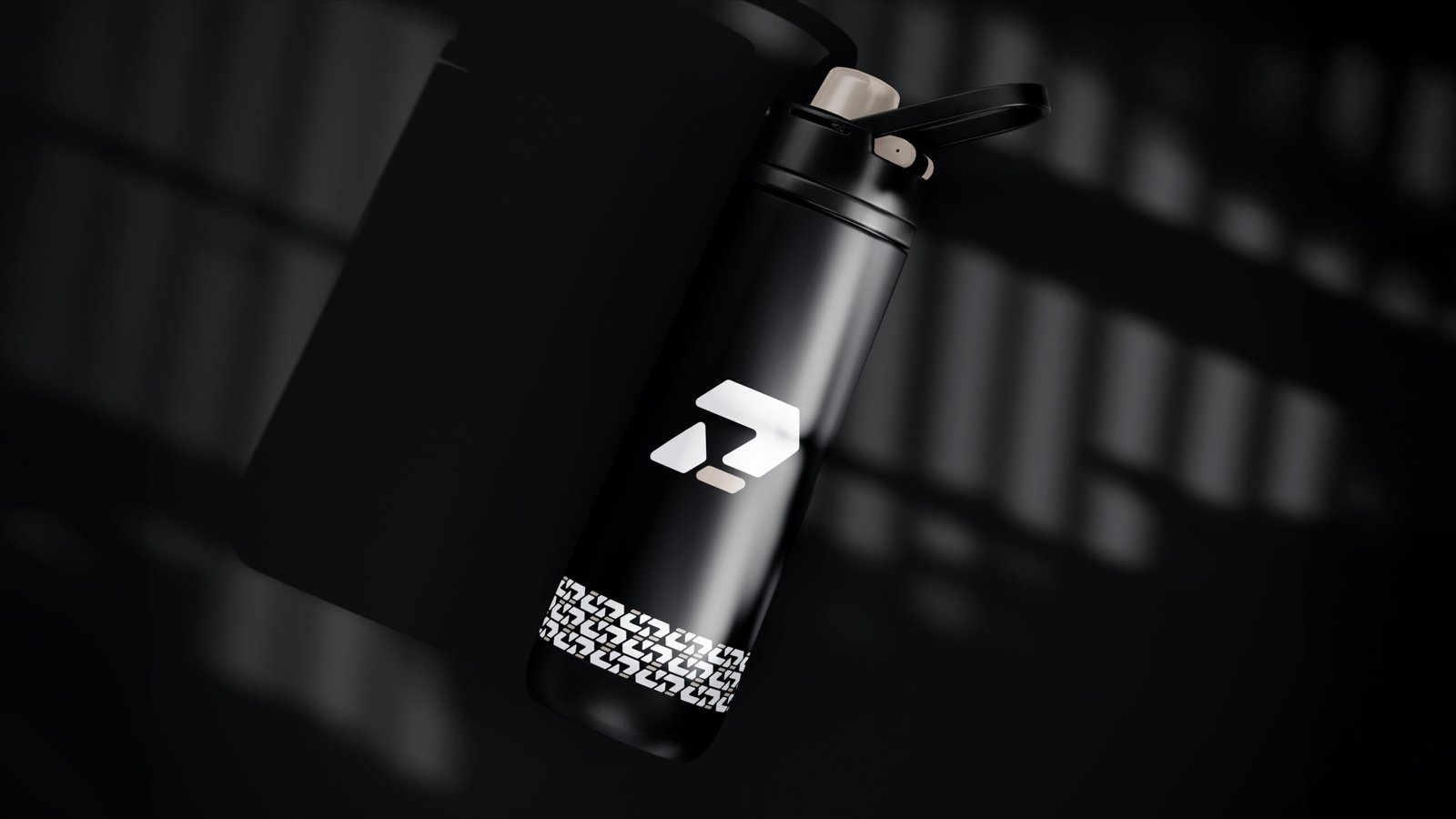
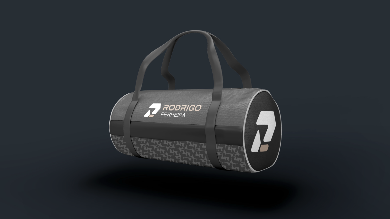
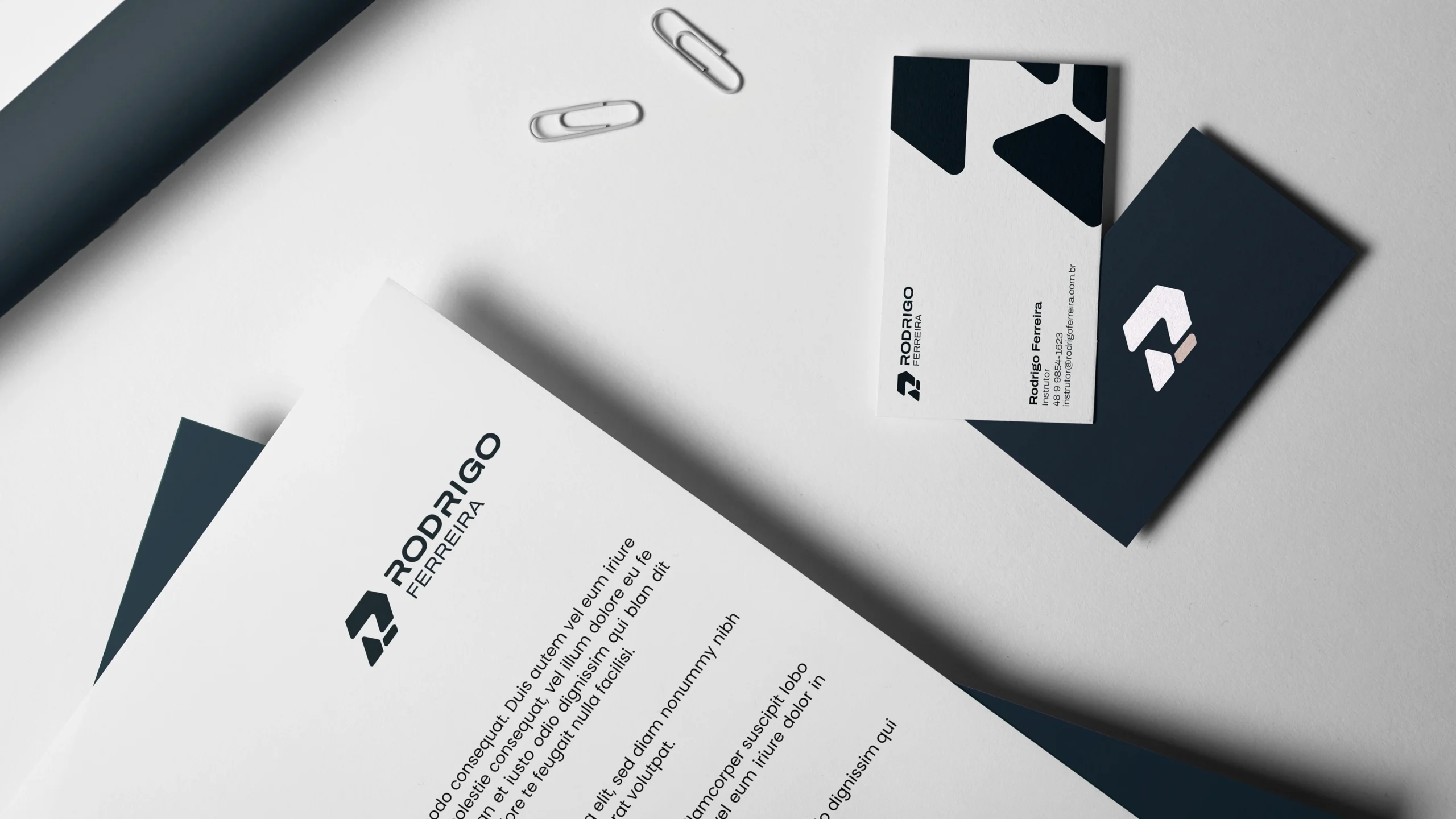
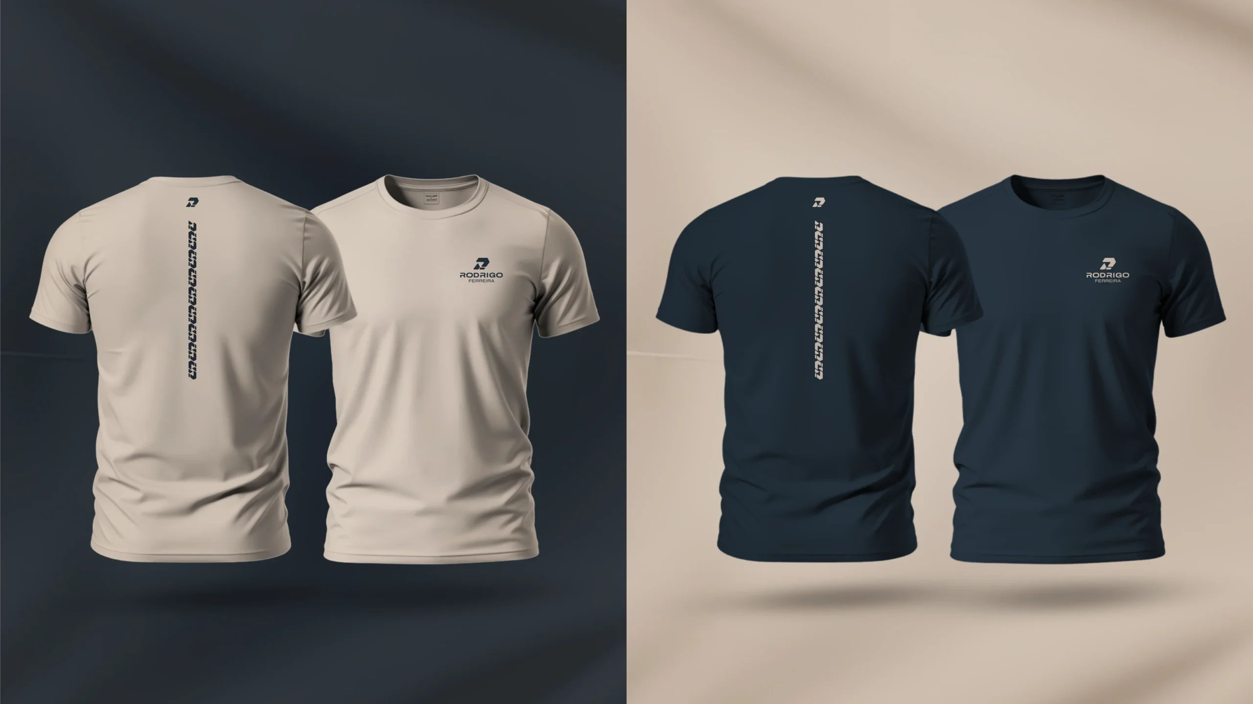
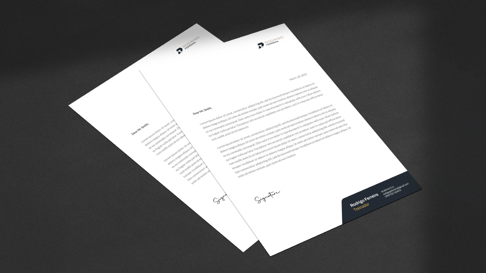
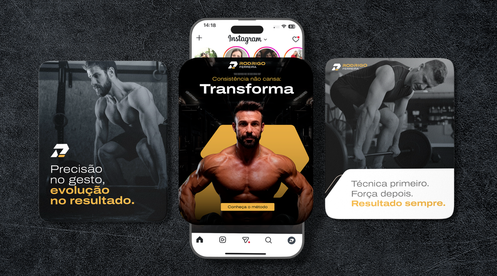
Rodrigo finished the process with the complete system in hand: purpose, tagline, logo lockup, symbol, pattern, palette, typography, applications and guidelines. The T-shirt he wears at the gym, the card he hands out after a session and the proposal he sends on WhatsApp speak the same language, with the level of finish he demands from every repetition.
Project details
Nozes team
- Brand Strategy
- Mariana Belchior de Araújo
- Visual Identity
- Mariana Belchior de Araújo
Chopin Lizt - Service
- Branding for personal trainers: brand strategy consultancy and visual identity
- Deliverables
- Purpose, promises and values, attributes and tagline, logo lockup and variations, symbol, pattern, typography system, color palette, T-shirts, social media template and avatar, letterhead, business card, sales proposal, branded gifts and visual identity guidelines
- Duration and year
- 8 months · 2025
Client team
- Rodrigo Ferreira · Florianópolis, Brazil
- Rodrigo Ferreira, trainer
CREF/SC 020976 - Practice
- Intelligent strength training: movement analysis, tailored programming and individual guidance
- Tagline
- Precision in movement. Progress in results.
Direction before growth.
If you’re building a brand and want to know where to focus before investing, let’s talk.
Talk to Nozes Explore our brand strategy consultancy
Or, if you prefer: ola@somosnozes.com.br
See also: branding case study for law firms and all Nozes case studies