
Cases Studies
Visual identity for mental health clinics: Singulares Cuidado Integrado
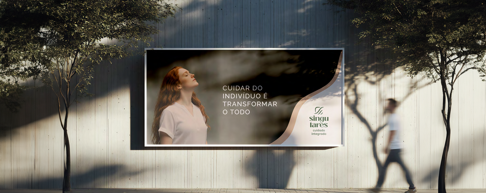
Every psychology practice promises a welcoming environment. Singulares Cuidado Integrado needed to communicate something more demanding: warmth supported by clinical expertise. Nozes translated that balance into a visual identity.
The challenge
Singulares grew from the work of psychologist Beatriz de Amarante, bringing together two strengths that rarely appear side by side in the field’s communication. The empathy to see the person behind the concern, with presence and attentive listening. And the competence to support the process with technique, knowledge and responsibility.
The practice’s mission reflects that breadth: care that begins in the individual session and extends to each patient’s relationships, family and community.
The design challenge was to turn this balance into a visual language without relying on psychology clichés. The brand needed to communicate closeness and trust, with clear signs of professionalism. Too much emphasis on emotion could weaken its authority. Too much on technique could make it feel cold.
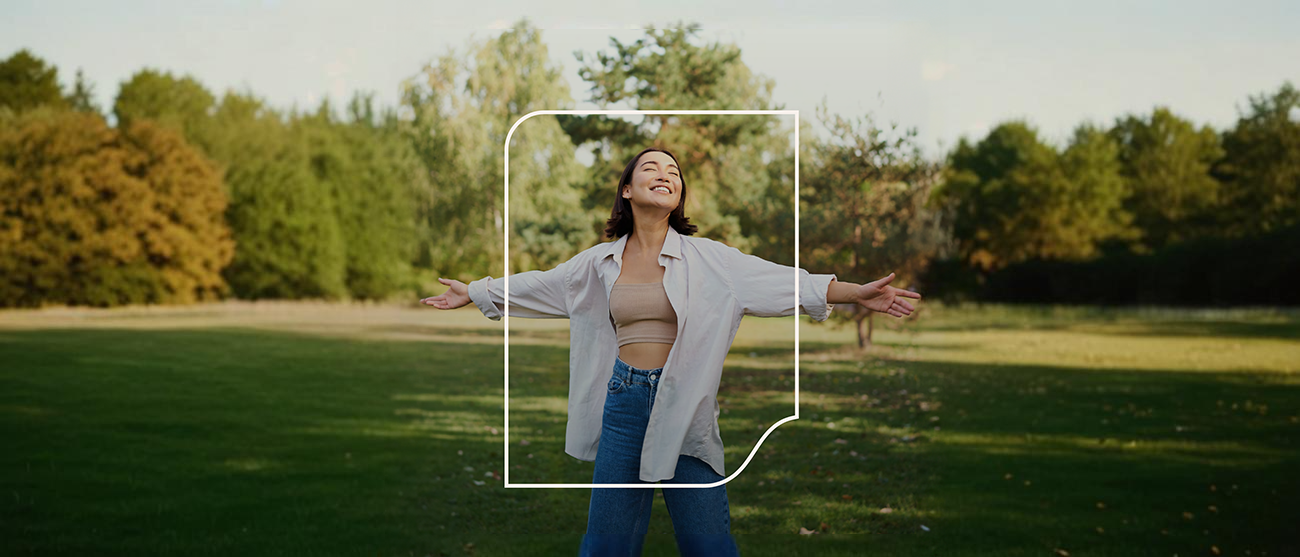
The symbol
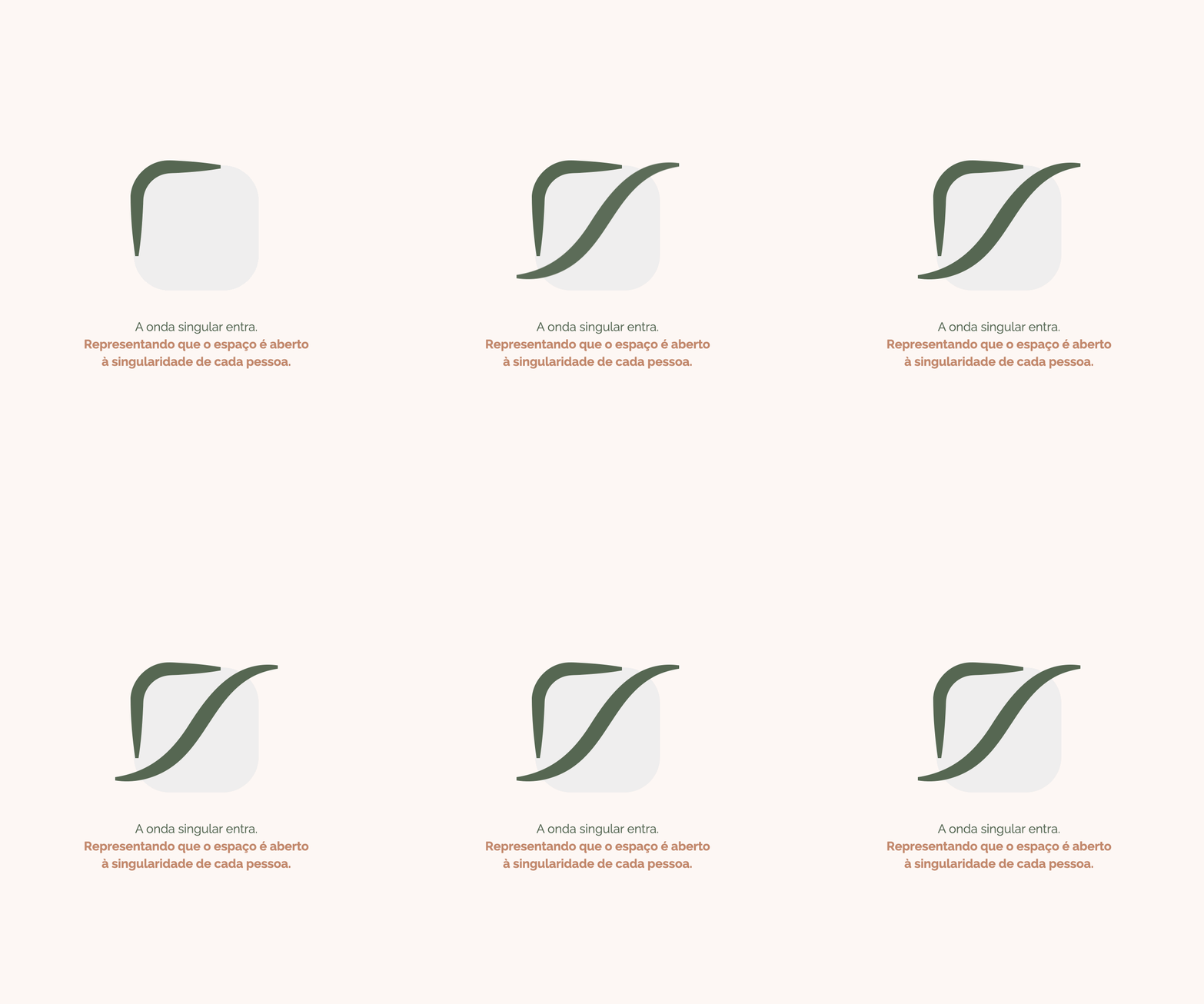
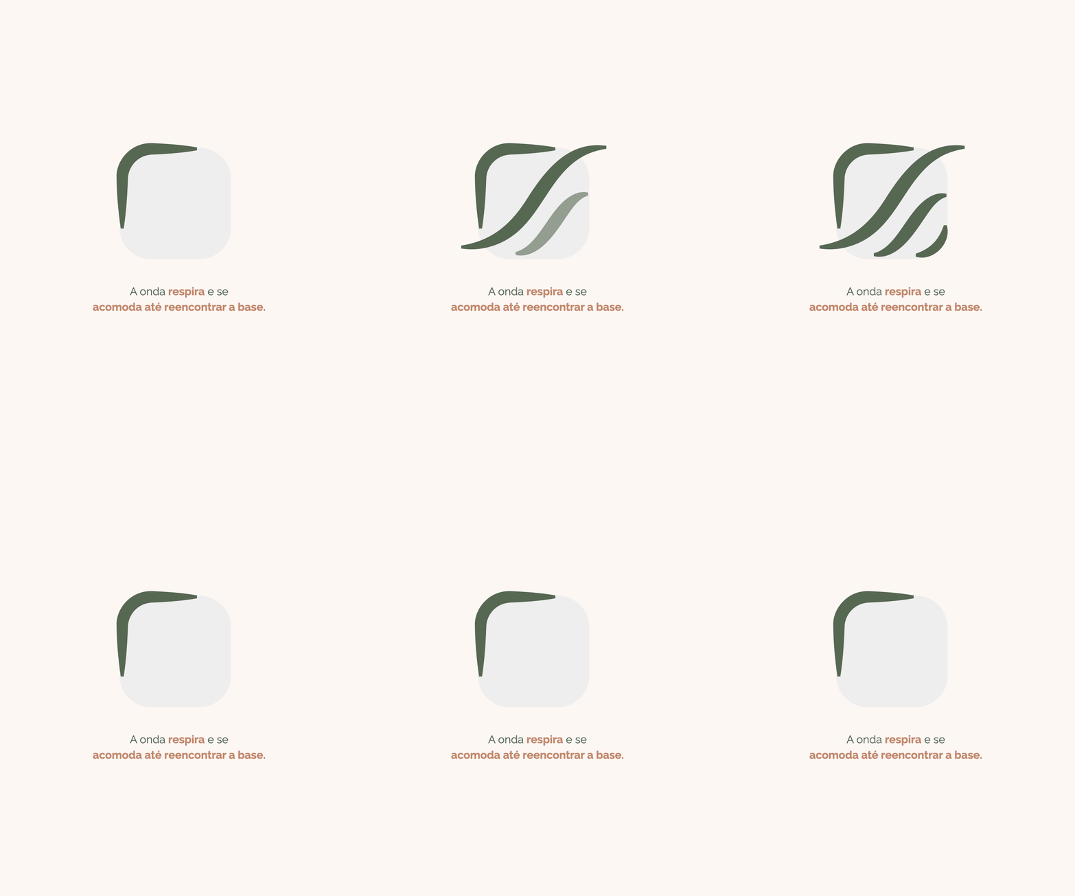
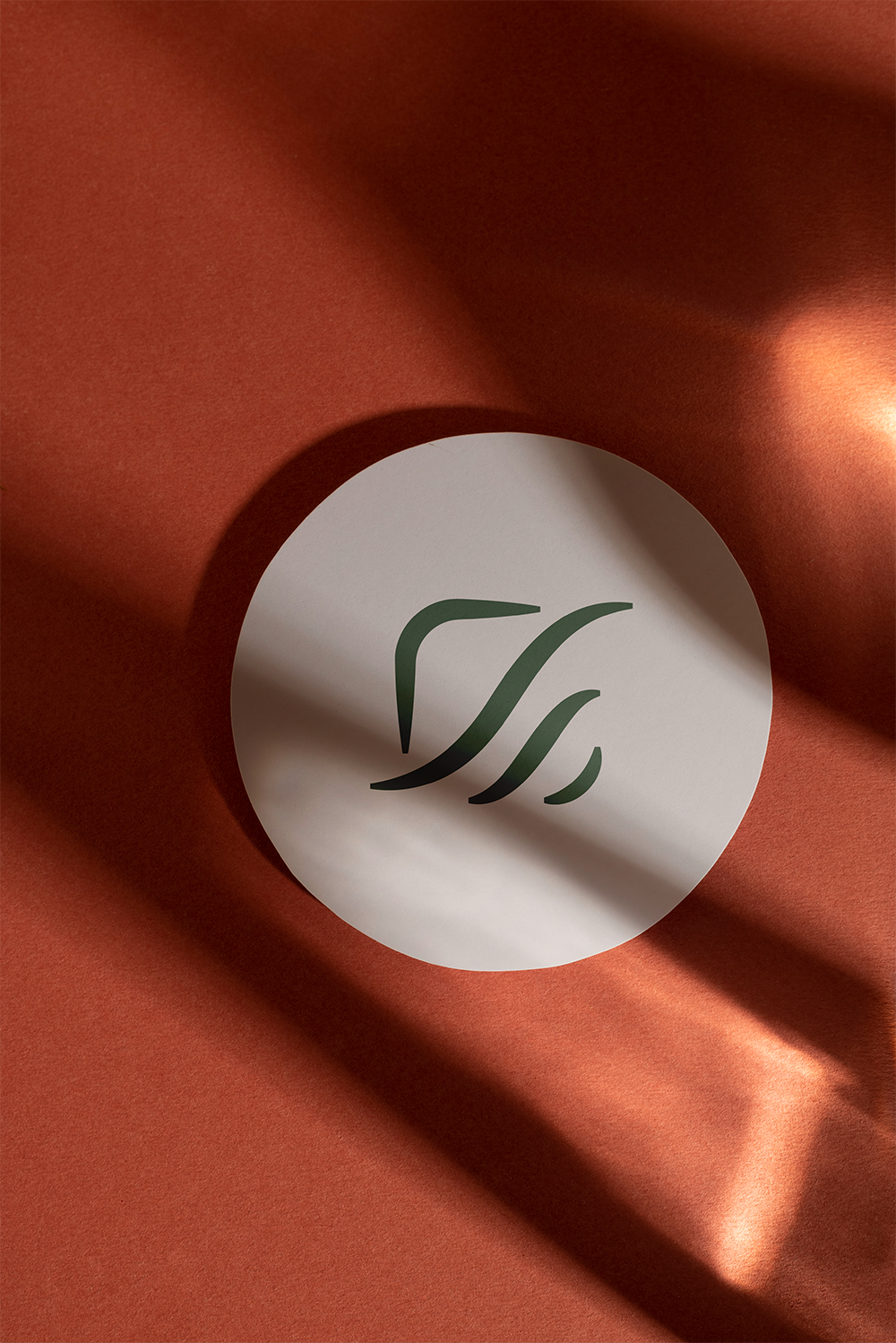
The answer came in a symbol that tells a story in four movements.
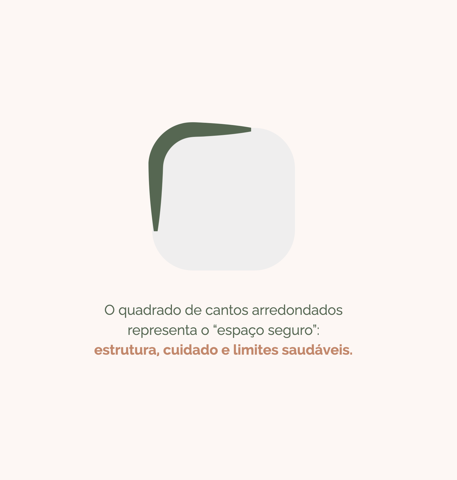
The rounded square represents a safe space: structure, care and healthy boundaries. A wave enters it, unique like each person who arrives. It breathes, moves and settles until it finds its base.
Clinical expertise that welcomes.
Every patient who sees the brand can recognize their own journey, even without naming it: a story that arrives and finds method, structure and sensitivity.
Four movements that explain the brand
The sequence below shows how the symbol expresses the identity’s central idea: an individual arrives, finds structure and can change with a sense of safety.

The system
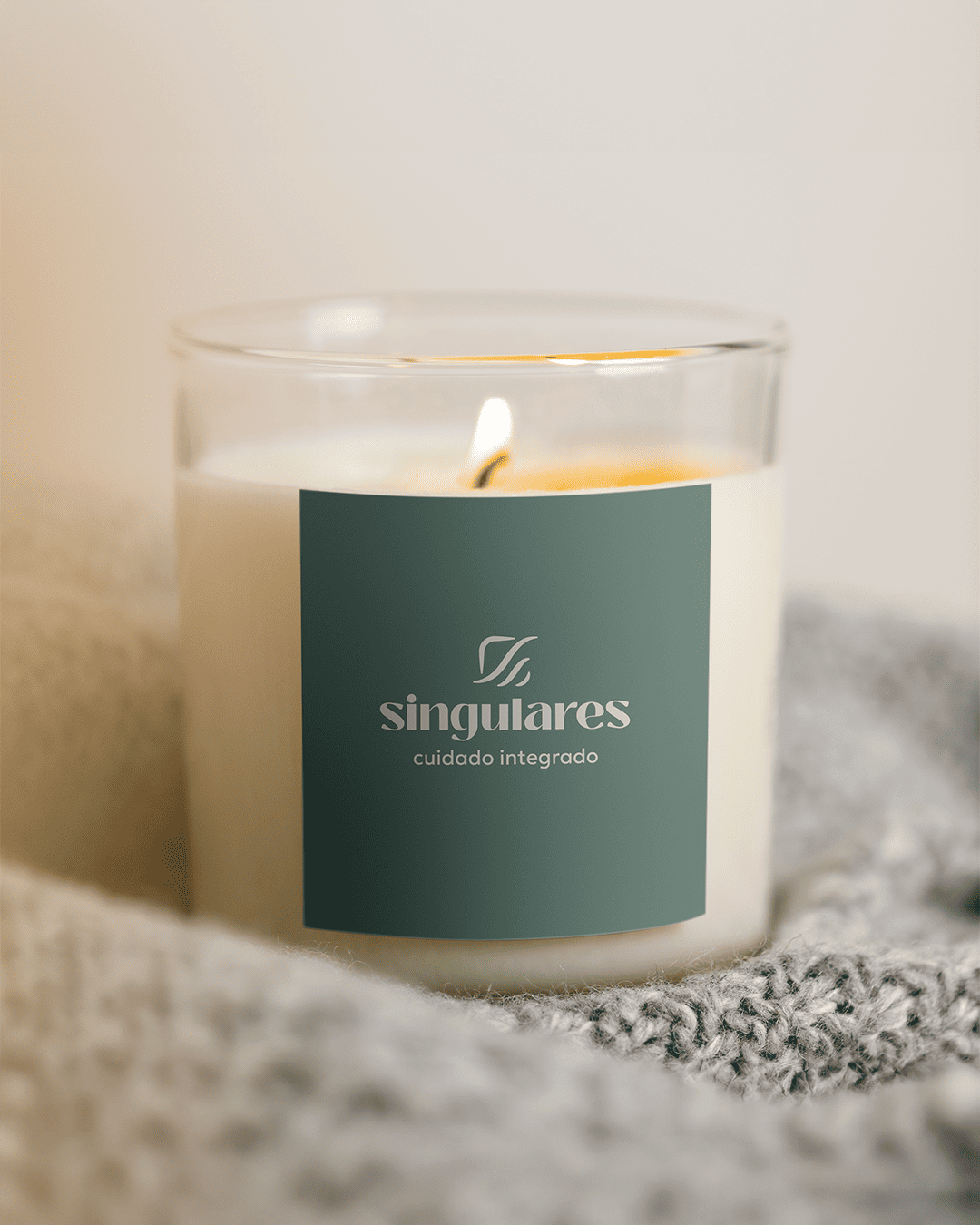
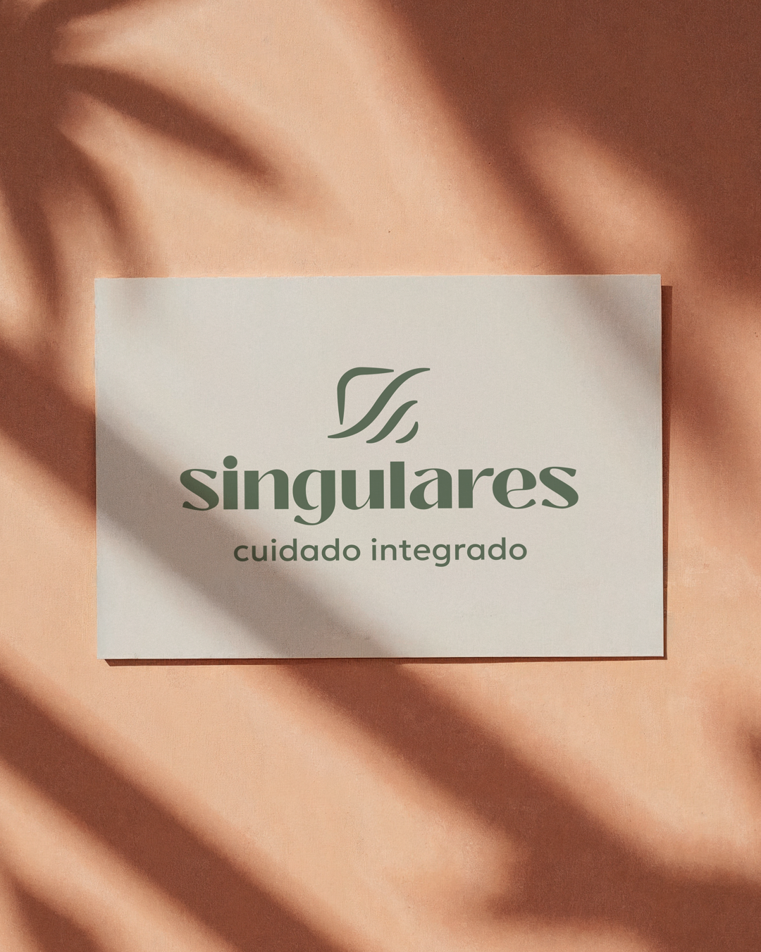
The palette and typography were designed as one system. Moss green conveys safety and stability. Terracotta brings human warmth and transformation. Sand creates breathing room, keeping the brand light and comfortable in the everyday life of the practice.
Lowercase typography feels approachable. Pairing a minimal geometric typeface with an elegant, high-contrast one adds clarity and refinement, visual signals of professional competence.
Every choice serves the same brief: to welcome people with care and professional rigor.

Palette, typography and atmosphere
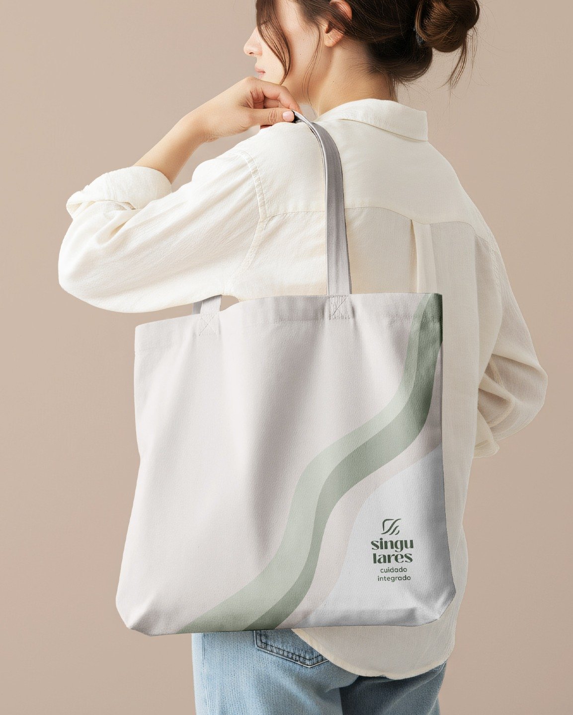
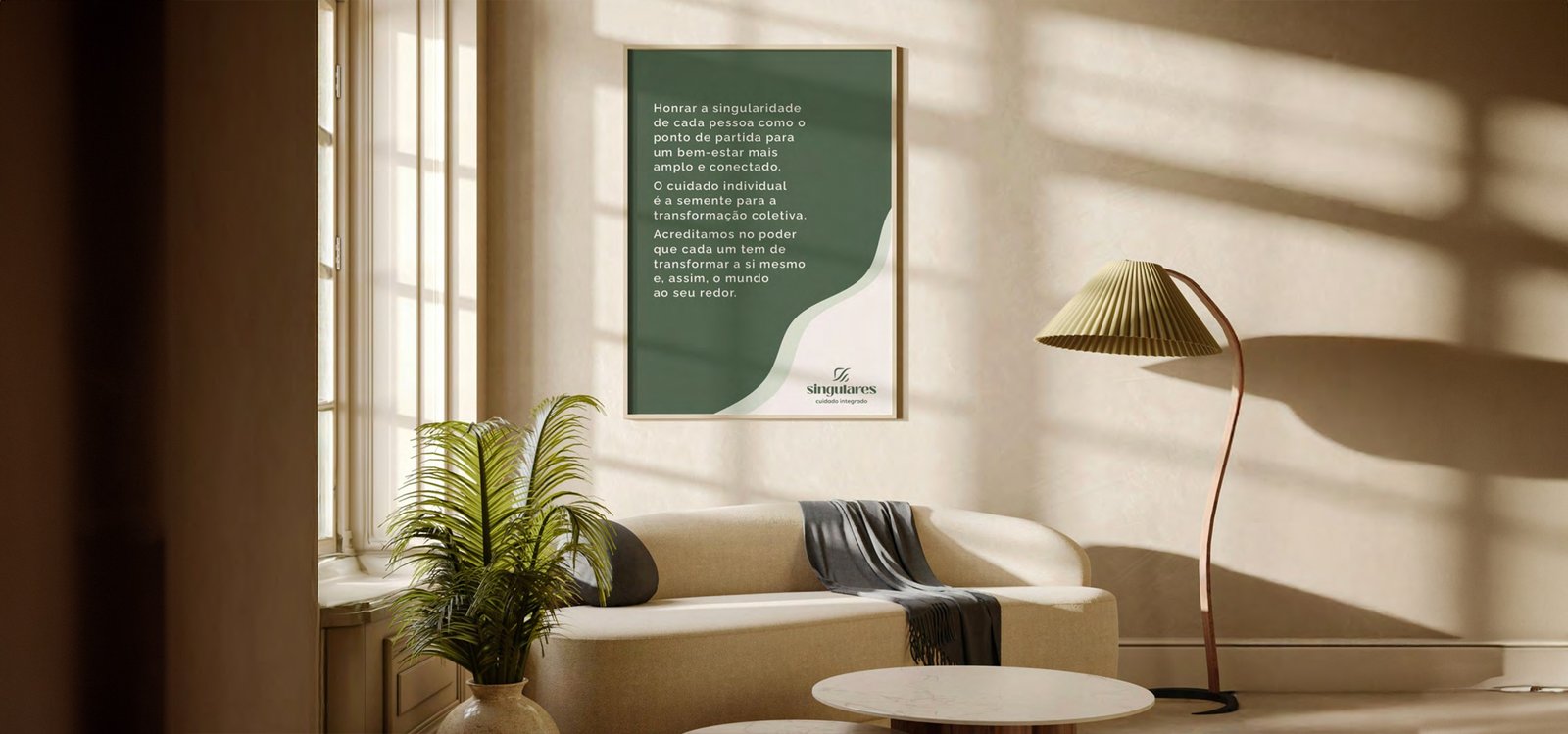
The visual system balances warmth and professionalism with a clear identity. The brand needed to feel human, organized and consistent.
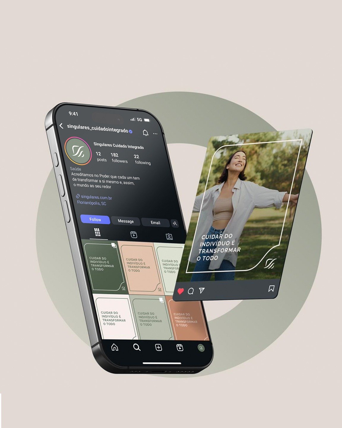
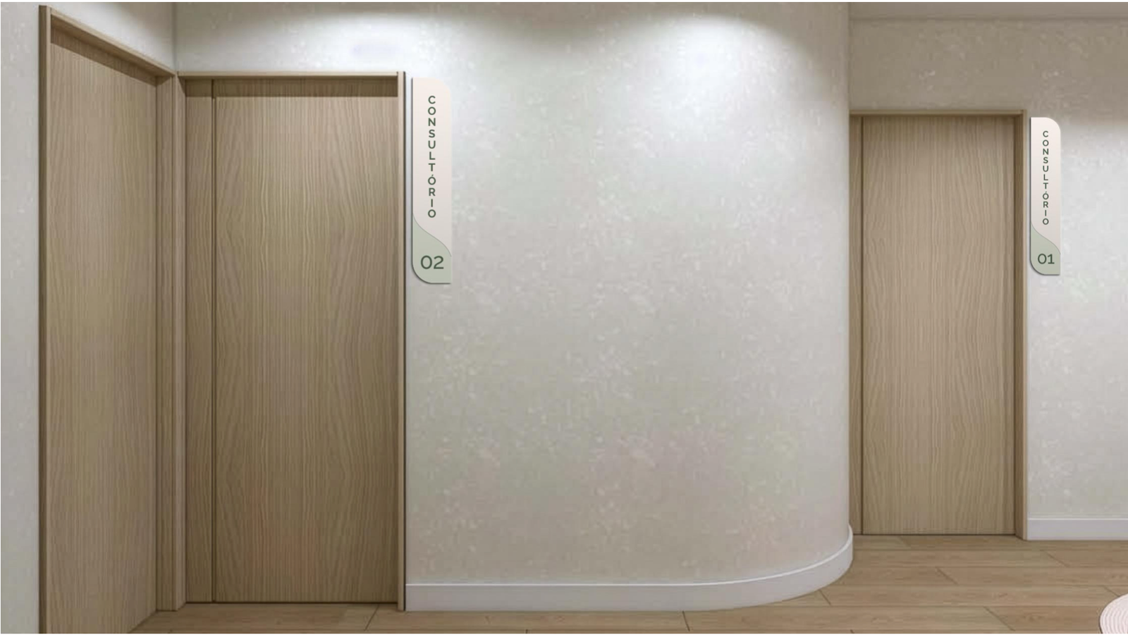
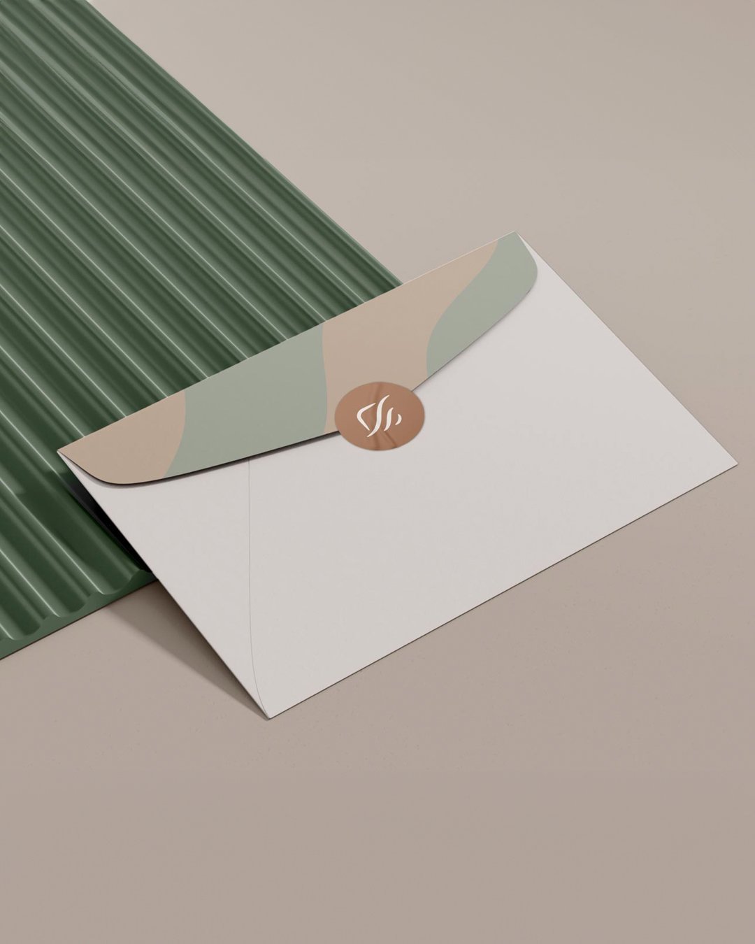
In practice, this makes the identity easier to apply across printed materials, social media, physical spaces and every point of contact with the practice.
The result
Singulares gained an identity that precisely expresses its essence: care that welcomes with professionalism and supports progress through method. A brand designed to be part of every interaction with the practice and recognized for what it delivers.
After two months, Beatriz had a complete visual identity system: symbol, palette, typography and the guidelines to keep everything consistent from then on.
Project details
Nozes team
- Design
- Ciliane Pereira
Mariana Belchior de Araújo - Strategic Narrative
- Mariana Belchior de Araújo
- Service
- Visual identity
Project
- Client team
- Beatriz de Amarante
- Duration
- 2 months
- Year
- 2025
If the quality of your work exceeds what your brand shows, let’s talk.
Nozes’s visual identity service turns your essence, positioning and brand principles into a clear system that helps your business grow consistently.
Talk to Nozes Explore our visual identity serviceOr, if you prefer: ola@somosnozes.com.br